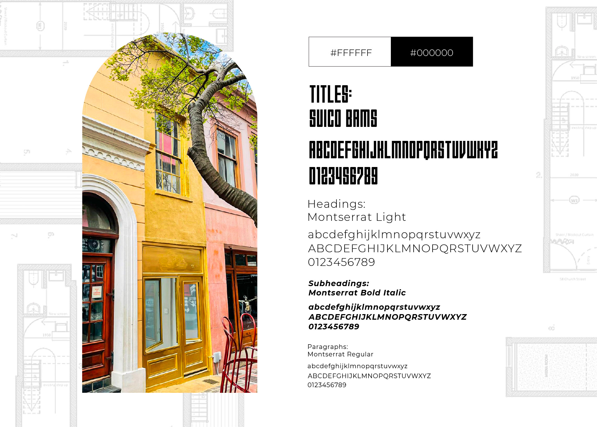
LOGO & VISUAL IDENTITY DEVELOPMENT
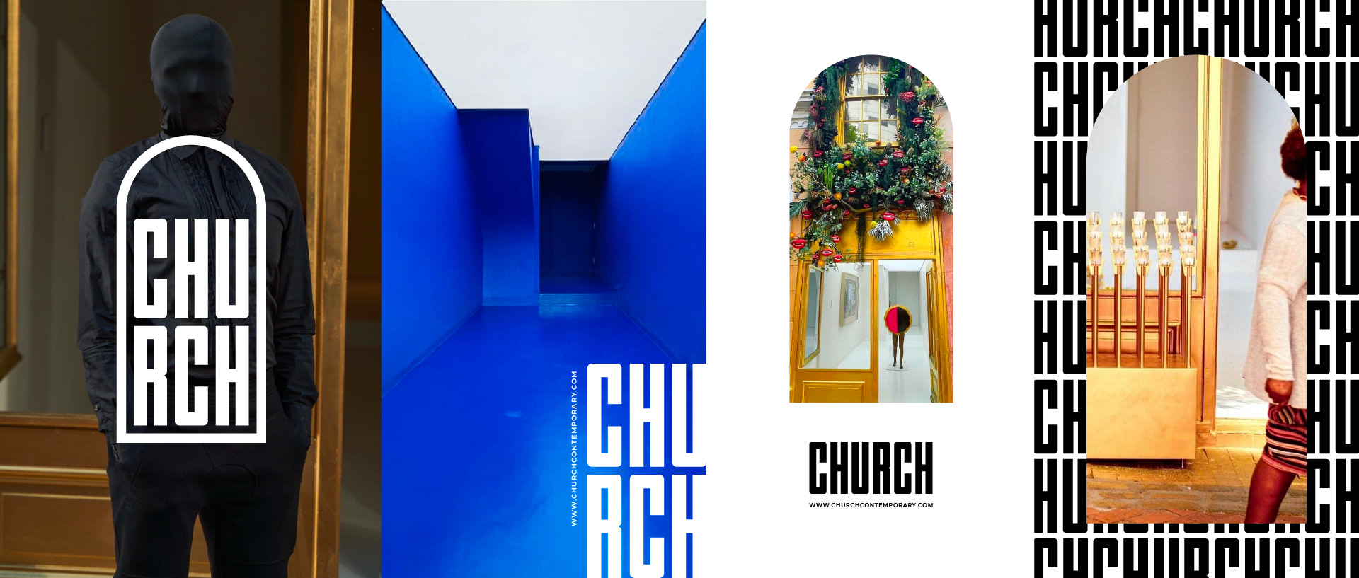
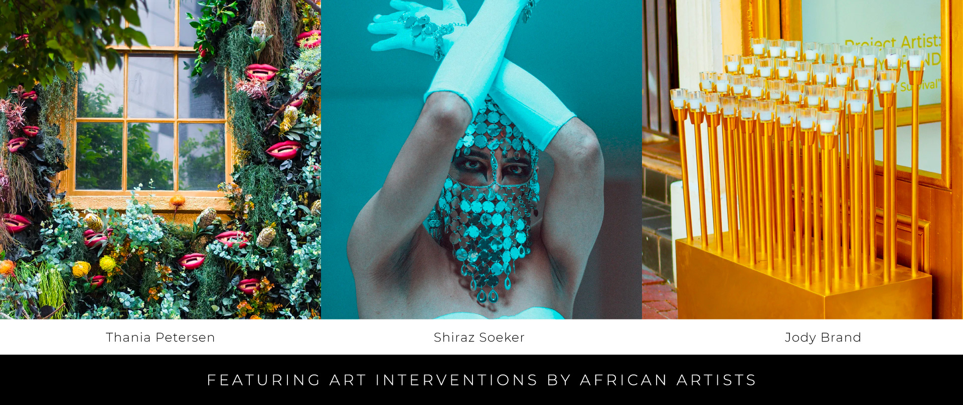
CHURCH is an unconventional black-owned Capetonian art space situated in a Heritage Building where it forms part of the vibrant Church Street inner-city art node. Founders Hoosein Mahomed and Shelleen Maharaj created this space to offer artists, curators, writers and other cultural agitators a platform to experiment - a fluid platform that is responsive to the needs of the art community, and is open to new works, works-in-progress, ideas or statements that might not be viable in other commercial spaces. Hoosein is a previous client and approached us to develop a logo and visual identity for the gallery. They wanted something simple and contemporary that wouldn't shout or be in contrast with any artists that may exhibit their works there in future. It had to be a bit of a blank canvass for them to reach out and work with any artist, without any conflict.
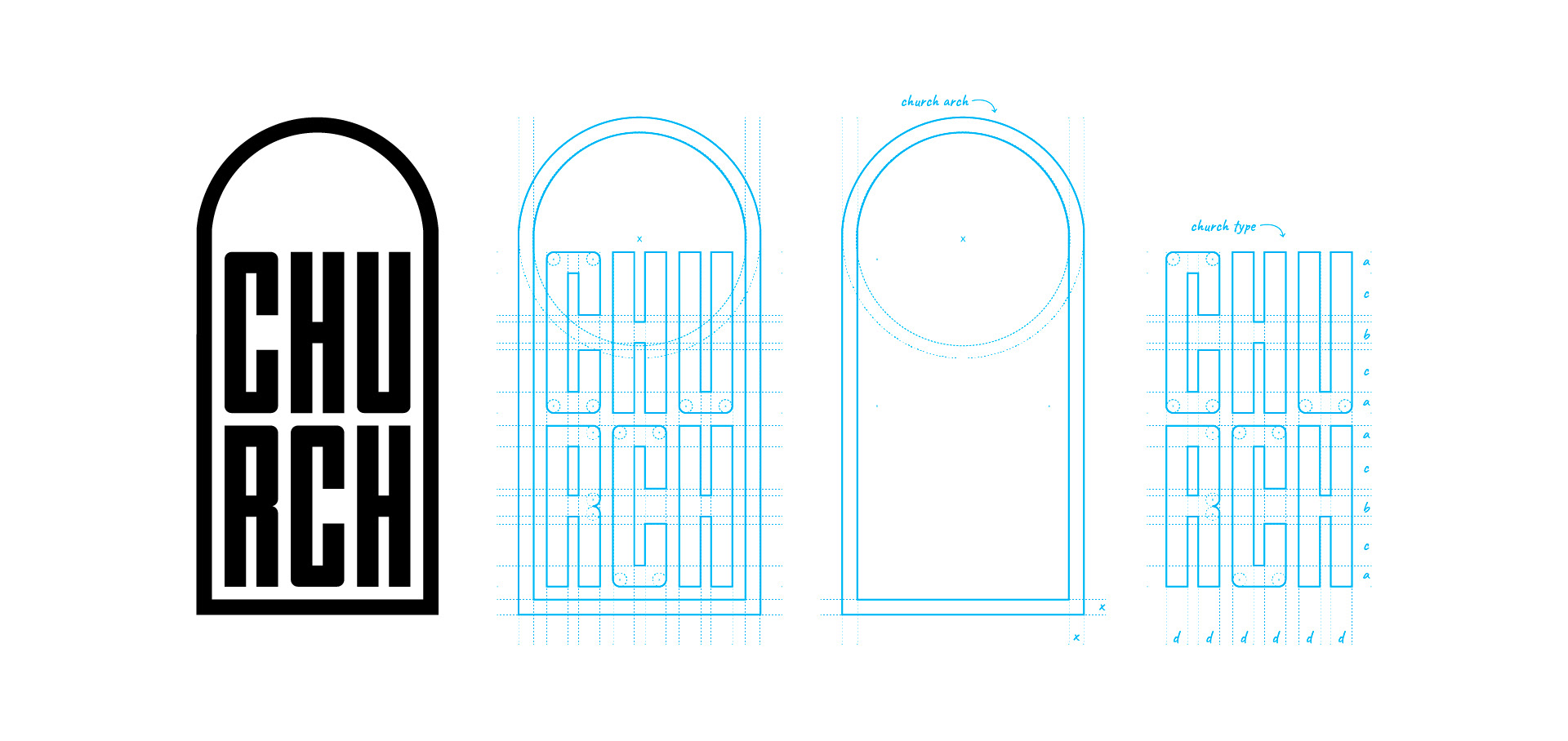
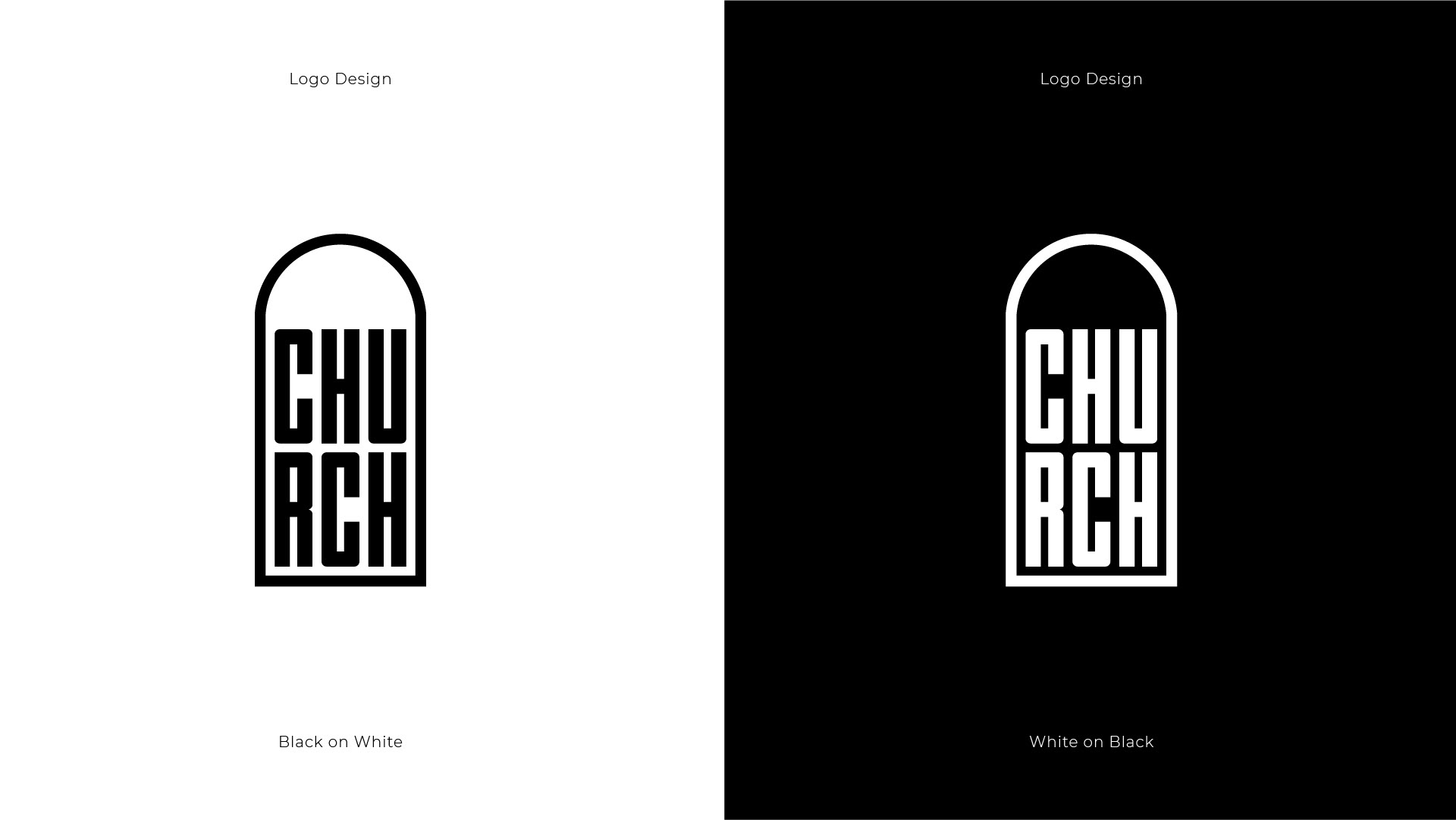
We started working on a very simple type design, which then evolved to include an icon element. The arch element spoke to what they were trying to achieve in terms of creating a hallowed space for artists, and elevate the type design to something that would speak to this reverence for creative work. The logo and arch icon has since been applied on the CHURCH website, email signature invites, stationary, and the type element also features on the building in striking gold. It was an inspiring project to work on because we were able to assist these visionary proponents of the art to bring their passion project to live in some small way. It's turned out to be a great space and we are very glad to have been involved.
We started working on a very simple type design, which then evolved to include an icon element. The arch element spoke to what they were trying to achieve in terms of creating a hallowed space for artists, and elevate the type design to something that would speak to this reverence for creative work. The logo and arch icon has since been applied on the CHURCH website, email signature invites, stationary, and the type element also features on the building in striking gold. It was an inspiring project to work on because we were able to assist these visionary proponents of the art to bring their passion project to live in some small way. It's turned out to be a great space and we are very glad to have been involved.