
From Comic Sans to AI Slop: 5 Decades of Bad Design Shortcuts
AI-generated design is everywhere right now, and people have opinions. Weird hands, mangled logos, strange wording - it feels like a very 2020s problem. Except AI did not start the fire.
Every generation has had a tool that made design faster, cheaper and easier to access. And every time that happened, people found brilliant uses for it... and some considerably less brilliant ones.
So before we blame AI for the death of good taste, let’s take a quick trip through five decades of shortcuts.
A small disclaimer: we’re not looking at when these technologies were invented, or at the incredible design work that defined each era. We’re looking at the point when these tools became accessible enough for everyday businesses, schools, offices and anyone with a computer to have a go themselves.
1980s: Photocopying
A fuzzy fiasco where every copy got a lil worse.
Photocopiers made reproducing flyers, notices and promotional material dramatically cheaper and easier. You could cut something out, glue it down, copy it a few dozen times and have your message out in the world before lunch.
Of course, every generation of the photocopier became slightly fuzzier than the one before it. Photos disappeared into toner, type lost its edges and visual hierarchy became more of a suggestion.
Was the photocopier the problem? Of course not. It gave small businesses and communities access to something incredibly useful. It also gave us some gloriously questionable flyers.

1990s: Desktop Fonts
1000s of fonts. Approximately zero restraint.
Then desktop publishing put a type library on the computer. Suddenly there were options. So many options. Comic Sans could be playful. Brush Script could be sophisticated. Papyrus could apparently make anything feel vaguely “authentic”. And if one font was good, why not use five?
Again, access was the win. Businesses could create menus, notices, newsletters and promotional material without needing a typesetter every time. Having the fonts was easy. Knowing which ones to use was still a different skill entirely.
2000s: Office Art
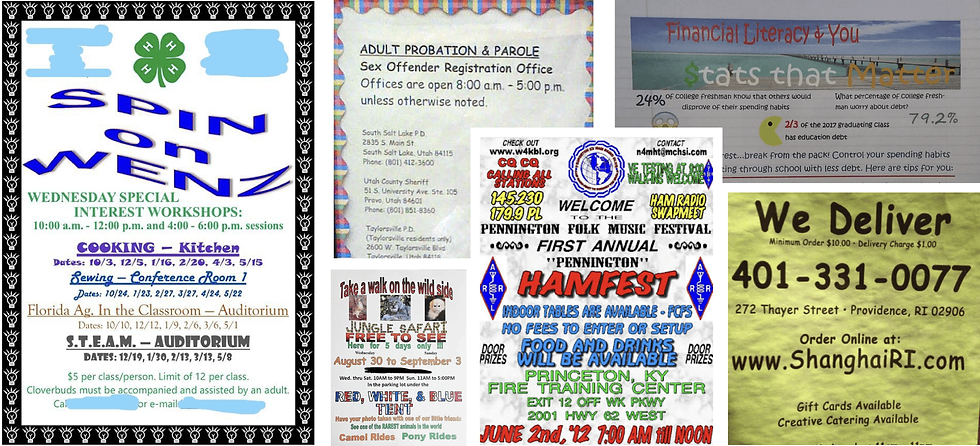
ClipArt & WordArt - Everyone is so creative.
By the 2000s, choosing a font was no longer enough. Microsoft Office gave us gradients, bevels, drop shadows, 3D text, ClipArt and enough effects to make almost anything “pop”. Why use one when you could use all of them?
A school project could have a rainbow headline. A company newsletter could feature a cartoon handshake. A local event flyer could bend its title into an arch simply because WordArt said it could. Once again, the technology itself was great. More people could make things, communicate ideas and express themselves visually. We just occasionally got a little carried away.

2010s: Templates
Unique to you and 14,000 other businesses.
Templates took accessible design to another level. Platforms like Canva gave small businesses a way to create polished social posts, menus, presentations and ads without needing professional software or a designer on speed dial. We still think that’s brilliant.
The problem came when the template stopped being the starting point and became the entire identity. Swap the image. Add the logo. Change the colour - maybe... if you’re feeling creative - and publish. The work looked polished. It just sometimes looked remarkably similar to everybody else’s polished work.

2020s: AI Generation
6-figure businesses with 6-fingered ads.
AI has taken the same promise and turned the speed up dramatically. We can generate an image, draft copy, test an idea or create the beginnings of a campaign in the time it once took to find the right stock photograph. Used well, that is incredibly useful.
The trouble starts when speed becomes the whole brief. The work looks impressive at first glance, but the logo is wrong, the lettering doesn’t quite exist, and somebody’s hand has developed its own side hustle. Somewhere along the way, “fast” became more important than “right.”

Democratising design is good. It means more people can create.
A small business should be able to make a quick post without commissioning an agency. A founder should be able to test an idea before sinking money into it. Teams should have tools that help them work faster, create more and keep up with the constant demands of running a modern brand.
But for brands, all those tools should serve one simple purpose:
TO CONNECT WITH PEOPLE!
And people are paying attention:

Cheap only works if nobody notices the cost.
AI can automate the boring stuff. It can help you get past the blank page. It can generate ingredients for something bigger. Templates can give you a starting structure. Canva can save you from opening Illustrator every time the trading hours change.
Use them. Then bring yourself back into the work:
Edit the copy until it actually sounds like you. Check the details. Apply the brand properly. Decide whether the image makes sense for the audience. Ask whether the thing you’ve made deserves to be the thing representing your business.
Because in 2026, publishing an AI-generated design completely as-is is starting to feel a lot like putting Comic Sans on the company poster twenty years ago.
The tools have changed. The need for taste didn’t.


Comments